Calendar apps just need to manage appointments and notify us when they're about to start. That's just about it. So perhaps it's not surprising that in the 11 years since Google first launched Google Calendar, it's scarcely changed anything about the app, even as it grew to be one of the most popular ways to manage your appointments.
There's little new you could add to a calendar app that would make it better at its core job—but there are a lot of things you could tweak and fix to make your calendar work better for you. That's what Google has done with its new version of Google Calendar that was just released.
Here's how you can get the most out of the new Google Calendar and its 8 best new features.
Google Calendar, Meet Tomorrow
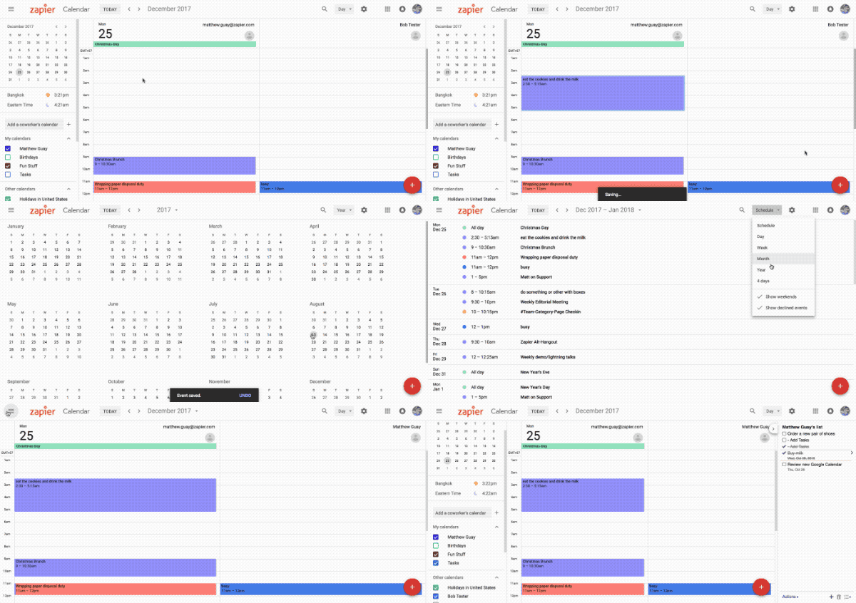
Bright colors. Large typography. Floating cards. Menus hidden behind 3 dots.
Google's Material Design first made Android phones and Google's mobile apps easier to use. And now, one by one, the G Suite apps on the web are getting the new makeover. Google Inbox started the trend in late 2014, followed by Google Forms and Google Contacts.
Google Calendar now joins the gang with a new design that's similar to the old app, infused with Material Design style (and a bit of AI to make your events more fun—no, really).
How to Get the New Google Calendar
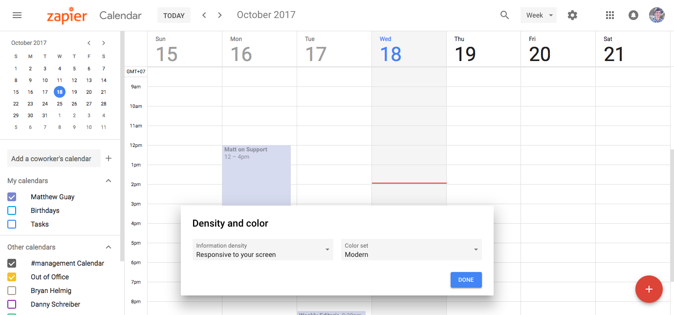
Anxious to give the new Google Calendar a try? Open calendar.google.com, and odds are there will be a blue Use new Calendar link in the top right. Click that, and seconds later your Google Calendar will be upgraded with the new design.
You'll get asked to choose information density (responsive, the default, is best) and color set (the new "modern" set features more muted colors, while the "classic" set has the same bright blues and reds that made the original Google Calendar iconic)—the defaults are likely best. And then you're off to explore.
If you don't have the Use new Calendar button, you'll likely see it over the coming weeks—and by the end of February, it'll be the new default, even if you don't upgrade today.
Now that you're in, here's how to get the most out of Google Calendar's best new features:
1. New Schedule View
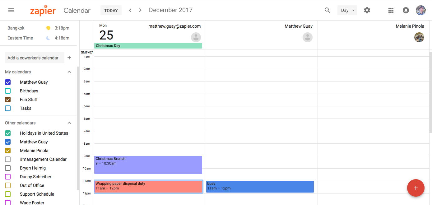
Perhaps the best feature of the new Google Calendar is slightly hidden in the Day view: a new Schedule view that can show you and your colleague's calendars side-by-side. It works best with G Suite accounts in a company where everyone's calendars are shared. Add your coworker's calendars from the left sidebar, then select the Day view from the menu in the top left of Google Calendar.
Now, click the checkmark beside your coworker's calendar, and you can see their schedule side-by-side with your own for that day. Need to see a different day? Use the mini calendar in the left sidebar to select a different day, or the arrows in the top to jump through events day-by-day.
You can't move events between the calendars—after all, the other calendars are owned by other people—but it is a handy way to see when other people on your team are free or busy.
2. Add Formatted Notes and Attachments to Events
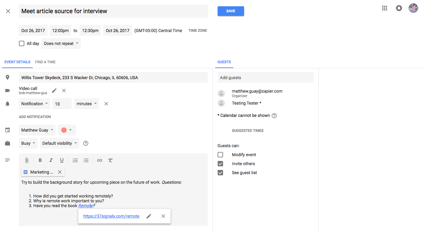
Ever wished you could add related files, links, tasks, and more to events? Your wish has been granted. The new Google Calendar event editor has all of the same tools as before in a new design—along with a fully redesigned Description box.
Click the Edit pencil icon on any event top tweak its settings, with familiar options for the event time, duration, location, and repeating settings. Add guests on the right, or use the Find a Time tab to use the Schedule view inside the editor to see when your attendees are free.
Then, near the bottom, you can add a description-this time with bold, italics, and underlined text along with organized and bullet point lists. Standard keyboard shortcuts work here, too—press CMD or Ctrl+B for bold text, and CMD or Ctrl+K to add a link.
Click the paperclip icon to add attachments. That opens the Google Drive file browser where you can add Google Docs files or upload a new file just for this event.
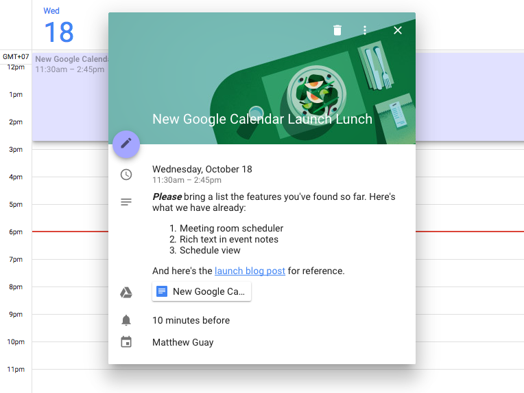
You can then see all the event details—including attachments and links—by clicking on the event in your calendar.
3rd party calendar apps including the default Calendar app on iPhones don't yet support the new rich text descriptions, so new Google Calendar events show up with HTML formatting—and without attachments—in those apps for now. But if your whole team uses Google Calendar online, it's a great way to include all of your event details in one place.
3. Schedule Meeting Rooms
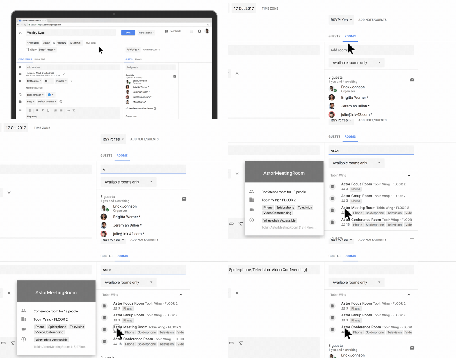
Google Calendar's event editor also includes a new tool: a Rooms scheduler for G Suite accounts in teams. Right beside the Guests tab where you add event attendees, there's a new Rooms tab where you can search through your company's available meeting rooms, see what features they have, and add them to an event directly.
Much as with adding event attendees, you'll type the name of the room in to see matching rooms, then can filter by availability to only see the rooms you could that will be free during your meeting time. Once you've saved the appointment, you won't have to worry about a meeting room being double-booked (or needing to remind your team where you're meeting at the last minute).
4. Simplified Appointment Slots Tool
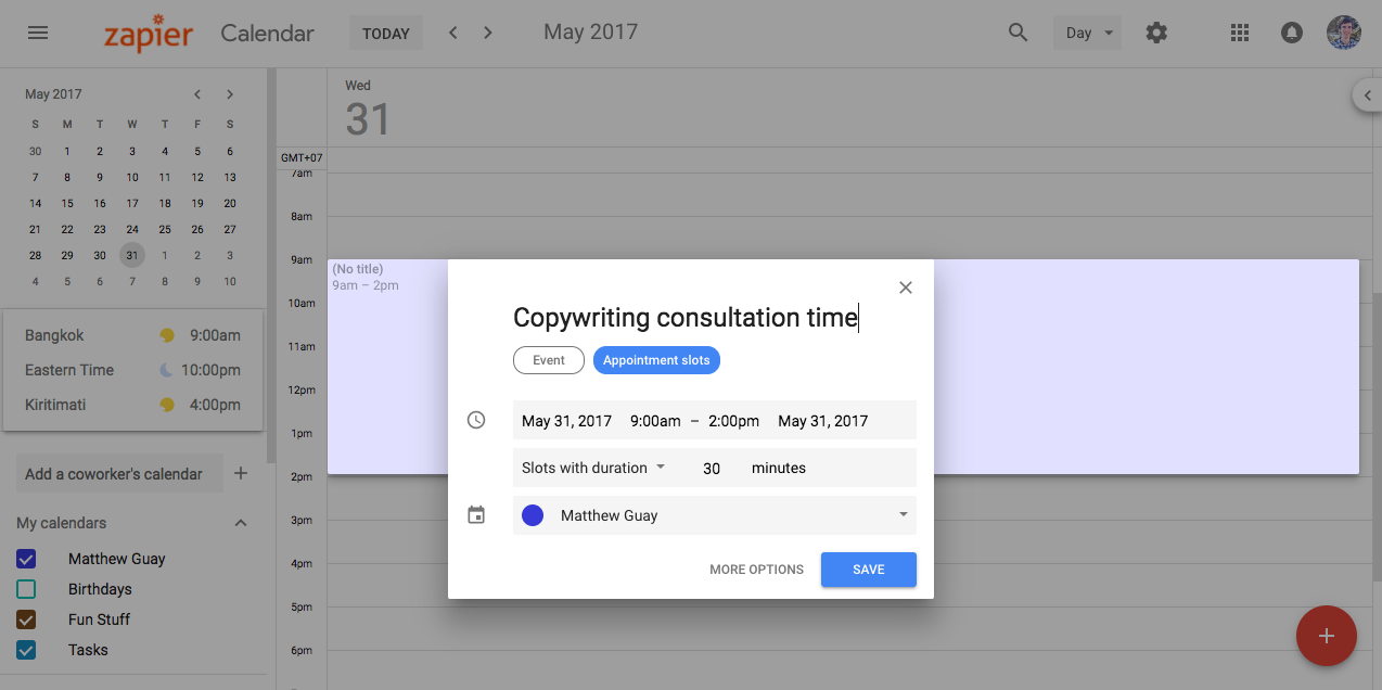
Google Calendar has long include a simple way to add an event from the Day view: Just click and drag over the time when you'll be busy, then type the event details in the popover dialog.
In that popover in the new Google Calendar, there's a rather obvious Appointment Slots button under the event name, something that turns out was in the old Google Calendar but somewhat more hidden and hard to use. It's a way to mark time on your calendar as free for meetings—with a link you can share with others so they can book an appointment with you during one of those time slots.
To add appointment slots, open the Day, Week, 4 Days, or Schedule view, and click-and-drag over the time period when you want to schedule meetings. Click the Appointment Slots button, then choose how long you want each meeting to run. Or, click the More Options button to make those slots repeating and to add a description, guests, and meeting room to the time slot.
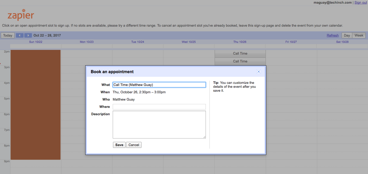
Once it's added, click the event then click the This calendar's appointment page link in the description to open a booking calendar in a new tab. Copy that link and share it with others so they can book an appointment with you from one of your available appointment slots. You could even include the link in your email signature for an easy way to share it with everyone.
Now, when someone wants to meet with you, they can open your calendar, see when you're busy, and book an appointment at a time when you've marked yourself as free—not just when there's a blank space on the calendar. It's a great way to simplify meeting booking without back-and-froth emails, one that's vastly improved in the new Google Calendar.
5. See More With a Year View
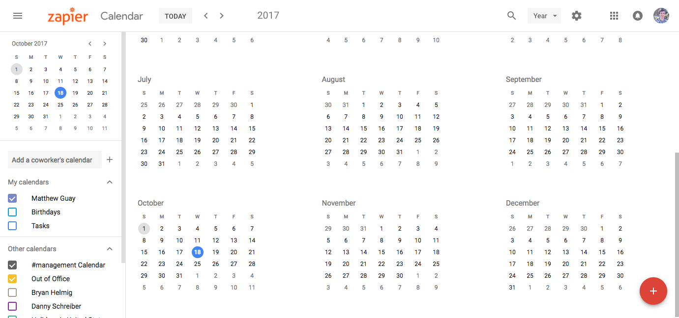
Ever wished you could zoom out on your Google Calendar? Now you can with Google Calendar's new Year view.
Click the view menu in the top right and select Year (or press y on your keyboard) to see the entire year at a glance. Dates with events aren't highlighted—but click on a date and you can see everything that's schedule in a popover. Or, double-click on a date to open it in Day view for a quick way to jump back or forward in time.
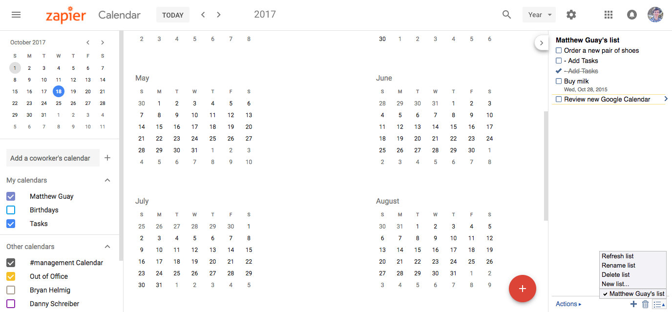
And just in case you were wondering about Google Tasks, it's still in the new Google Calendar—amazingly with the very same design as before. Check the Tasks calendar in the left sidebar to open Google Tasks in a right sidebar.
Everything's exactly the same as before, down to the menus and sparse features. The only new thing is a small tab in the top of the sidebar to hide it—and then you can click that tab again to re-open it.
Google Tasks is still an easy way to jot down tasks in Google Calendar and Gmail—and hopefully it will get its own redesign soon.
6. Find Anything with Integrated Search
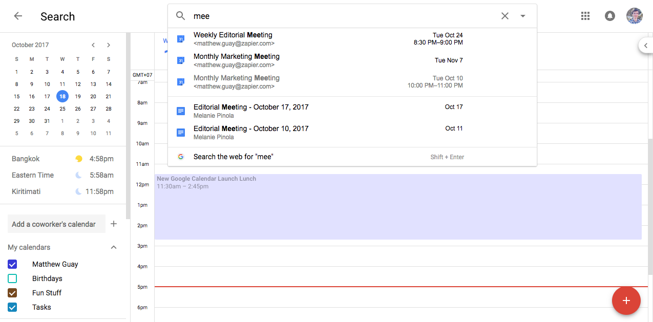
Google's synonymous with search, so it's only right that you should be able to quickly search through everything in G Suite from any Google app. In the old Google Calendar, though, you could only search through events.
That's changed in the new Google Calendar. Click the search icon and type in your query, and Google will find documents, contacts, and events that match. Click an event to open a quick preview; click a document, and it'll open in a new tab; click a contact, and Google Calendar will show a list of every event with that contact.
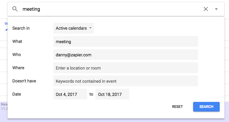
Need to find a specific event? Click the down arrow on the right of the search box to open Google Calendar's Advanced Search. You can choose which calendars to search through, invitees and locations to watch for, search terms to find (or not find), and a specific date range to search. That should be enough to find what you need. It's the same advanced search options from the old Google Calendar, with a new design.
7. Track Time With a World Clock (note, weather is removed)
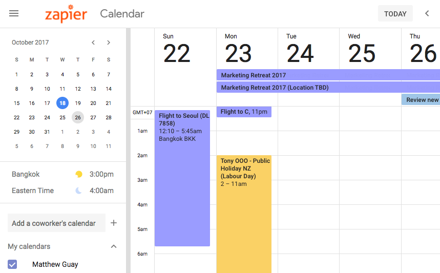
Google Calendar's scheduling tools help you see when people are busy—but if you're working in different timezones, it might not be quite as obvious when they're sleeping. There's a new Google Calendar tool to help with that: a World Clock that you've likely already noticed in the screenshots.
Tucked away under the month calendar in the sidebar, the world clock shows the current time, the city or time zone, and a sun or moon to tell if someone should be sleeping at a glance. It doesn't show the date if someone's in the future—but it does show the official GMT+/- timezone if you hover your mouse over the clock.
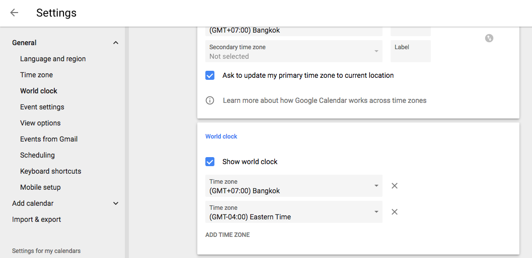
You'll first have to enable Google Calendar's world clock. Click the gear icon in the top right and select Settings, then scroll down to the World Clock pane and check Show world clock. Then, click Add Time Zone and select the correct time you want. In a few seconds, you should be able to get a quick overview of the current time for your entire team as a handy counterpart to the Schedule view.
8. Tweak Calendar with Redesigned Settings
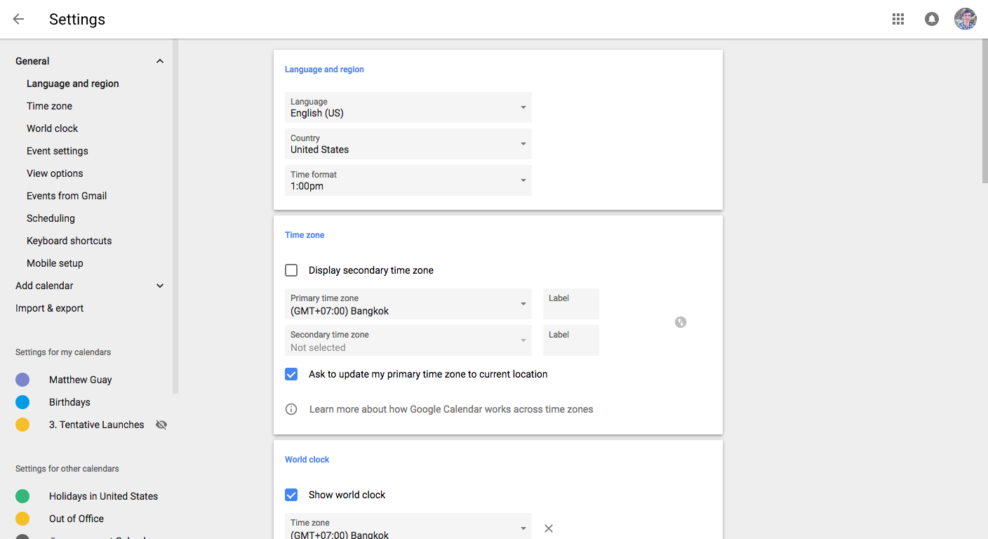
Perhaps the most boring part of any app is its settings page. It's worse in Google's apps. The old Google Calendar Settings page was one long list of options and checkboxes—and tweaking individual calendar settings meant opening the calendar's menu and finding its own settings page.
Everything's simpler in the new Google Calendar. To open settings, click the gear icon then click Settings—or press S on your keyboard to open it.
The options are now organized in groups, making it much easier to find new options. You can add new time zones, set your default event duration, and choose your working hours—all options that Google Calendar included before, but they're now more obvious.
Two settings options are new: the aforementioned world clock, along with a mobile setup settings at the bottom of the page which lists the number you've added to your Google account for verification. Then, there are a couple things missing: the option to show weather on the calendar is gone, as is Labs tab with experimental Google Calendar features. Two popular Labs features—year view and world clock—are now built-in, though.
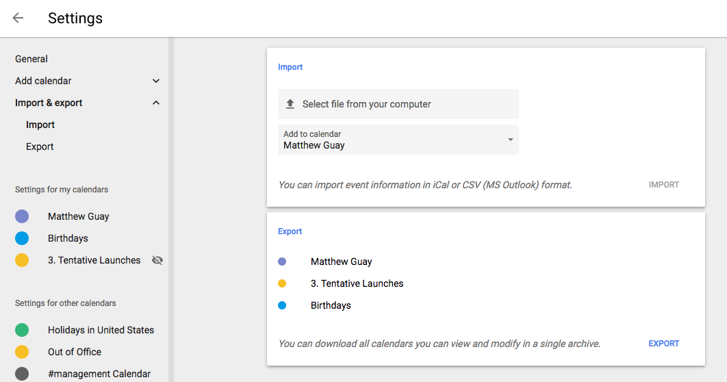
Extra settings are tucked away in the left sidebar. You can add calendars (including ones for holidays and sports), and import or export calendar files.
Need to change the notification settings on an individual calendar? Select it in the menu to change its time zone, choose when event notifications will be sent, and set which type of notifications you'd like emails or SMS messages about.
It's all things you could always do with Google Calendar, only now, it's far easier with the redesigned menu and settings.
Bonus: A Holiday AI
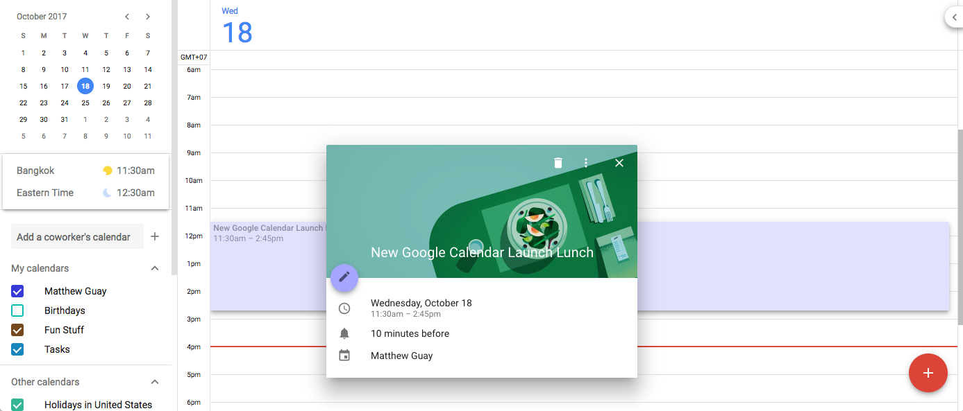
"Wait," you say, "didn't you promise that the new Google Calendar makes your events fun?"
Yup. Try adding an event with a holiday name like New Years or a meal time like brunch in the description, then click on the event. Instead of a colored card with your event name, Google Calendar will automatically add a festive header graphic that matches your event. It doesn't work with every holiday—and meal times where the only other way we found to get the headers—but it's a fun little extra when it shows up. Oh, and try adding a holiday and a meal together, like Christmas brunch, for a fun mashup.
Perhaps sometime soon there will be a way to add your own event headers—or not. It's not like we should spend more time in our calendars anyhow.
You likely look at your calendar app less than a half hour each week, relying on notifications the rest of the time. And that's how it should be.
With the new Google Calendar, you'll hopefully spend even less time in your calendar—and more time getting the work you're scheduling done. And when you do open your calendar, you just might find that Google's decorated your next event for a little something special in your schedule.
source https://zapier.com/blog/google-calendar-schedule/

No comments:
Post a Comment