From the moment your users land on your site, you've started building a connection—one that can either enhance or diminish your brand. Creating a visual identity that resonates with your users helps lay the foundation for a consistent and trusting relationship.
As a user-centered company, we recently took steps towards making a unified visual identity—a guide and collection of resources to help staff and others we collaborate with know how to design and write with Zapier. This is where it lives, and here's how we made our brand more cohesive in six months (when typically this can take about a year).
Phase One: Discovery
In early 2017, our budding Design Team did a listening tour as a discovery exercise to help understand the current state of design at Zapier. We interviewed over 30 cross-functional team members at Zapier on video, asking them a series of questions around design and user research. Here are a couple of examples of the questions we asked:
- Tell me about your view of the Zapier brand and how it is incorporated into or relates to your work on [interviewee's team name].
- What can the Design Team do to help you and the work you do at Zapier?
After completing these interviews, we synthesized this information, using affinity diagramming to uncover overarching themes that appeared throughout these interviews.
Affinity diagramming is a user research method that is used to find meaningful patterns in qualitative data. To start, we took the notes from the tour and synthesized the statements and quotes into a spreadsheet. Each Design Team member was given a section from the spreadsheet. Each participant was tasked with writing one statement or direct quote onto a sticky note and place it on the wall. We put on some music and were able to get all of the stickies on the wall in 2.5 hours. After getting all of the sticky notes on the wall, we started to refine by grouping the stickies together. If someone disagreed with the placement of a sticky, they said out loud that they would move the sticky and why. We then started writing out our overarching themes and statements over our grouped findings.
One of the largest themes we uncovered was around the lack of consistency of the Zapier brand. From superheroes to rocket ships, there was no clear rationale behind the Zapier visual identity. This caused confusion not only for our growing Design Team on how best to create cohesive user experiences together, but also for new users who were unfamiliar with Zapier. With each Product Designer embedded on different parts of the product, creating a map for them to work from was a crucial step towards solving that problem.
Brand Pillars Workshop
In order for any company to be successful, Marketing and Design work in sync to communicate the brand effectively. At one of our biannual company retreats, we kicked off a Brand Exploration group workshop with the Marketing Team to help get a better understanding of the current state of the brand and where we wanted it to go in the future.
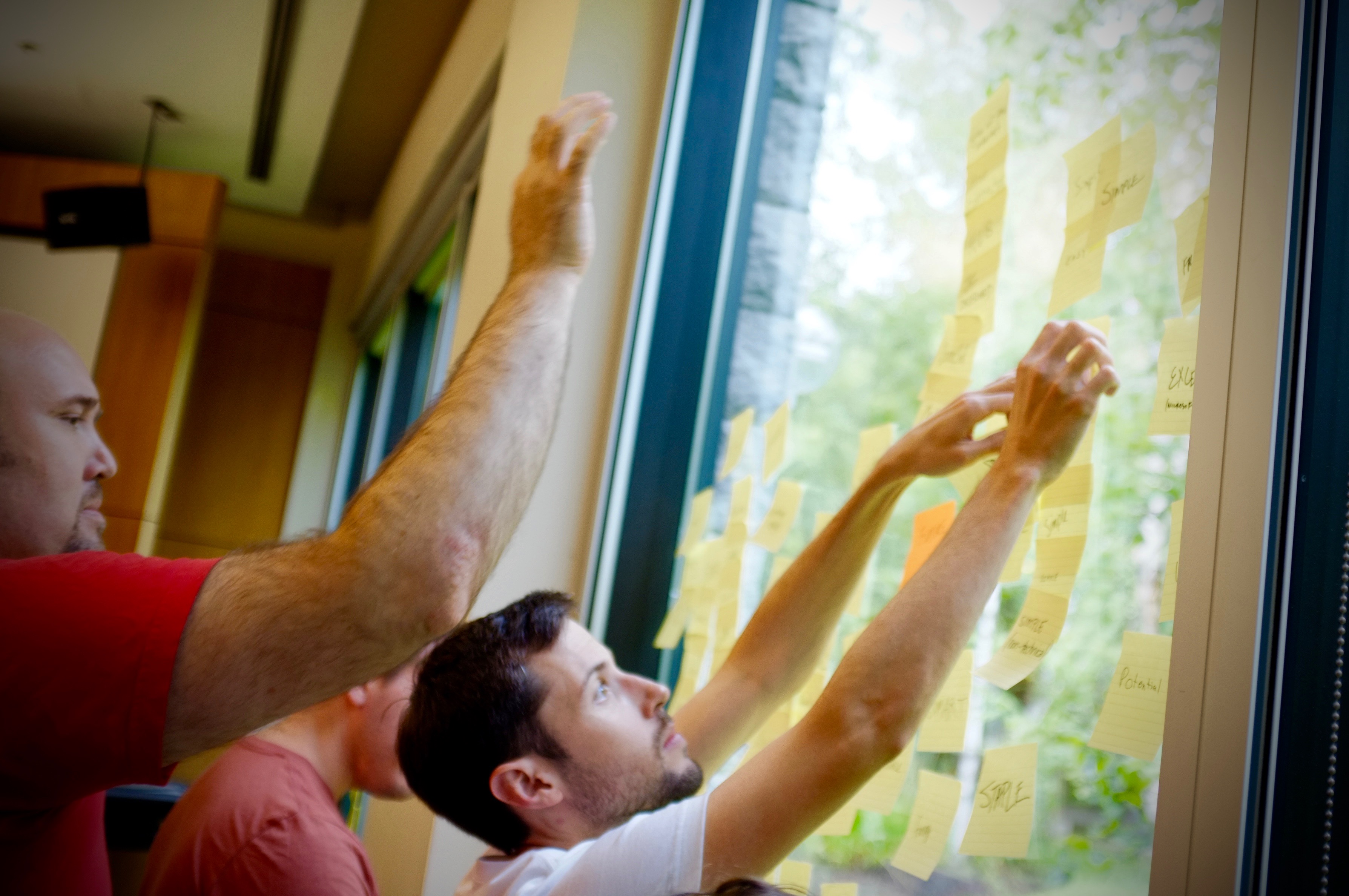
The focus of this workshop was to determine the current and future states of the Zapier brand, similar to Ahava Leibtag's "branding pillars" workshop from her book The Digital Crown. To start, we wrote down as a group what we mean when we say "brand." Below is a list of the items we all agreed on:
- Community
- Consistency
- Differentiation/Unique
- Embodiment
- Enduring
- Feeling of belonging
- How it makes you feel
- How you behave
- Identity
- Language
- Loyalty
- Memorable
- Outsized
- Perception
- Recognizable
- Reputation
- Style
- Tone
- Values
Once we had a collective understanding of what we mean by "brand," we moved into defining what we think our current brand says. The overarching themes we found for our current brand were:
- Future
- Orange
- Friendly
- Productivity
Now that we had our current state, we started talking about the future. What do we want our brand to say? Where do we want to go? What is the vision? After discussing some of these questions as a group, we came up with the following:
- Open
- Reliable
- Simple
- Approachable
Having determined the current and future state, the group discussed how to get the brand where we think it should be. We all agreed that consistency, focus, and research are the main points on how we get there.
After this workshop, we all had a clear understanding of the expectations around the Brand Exploration project and the unified goal between Marketing and Design.
User Interviews
Zapier practices user-centered design in almost everything we do. From our All Hands Support philosophy to seeing research as a team sport, we've created the practice of paying attention to our users' needs to aid in the direction of our product. Therefore, it made sense to kick off our brand exploration project by hearing from our users.
We recruited and interviewed new and current Zapier users about their perceptions about the brand. We asked them targeted questions to gather insights to validate or disqualify our current assumptions about the brand. Here are some of the questions we asked:
- What 3 words would you use to describe Zapier? Why?
- What would you say to someone if they asked you about what it's like to join Zapier?
It was interesting to hear what each person said about their experience and how it matched up with our Branding Workshop results. For example, we heard multiple users describe Zapier as simple, something that we saw as the future vision of the Zapier brand. Knowing this, we decided that a complete recalibration was unnecessary at this time and focusing on tightening up our current brand should be the priority. This user-centered and research-based insight helped us save time and energy towards this effort to create the right thing for our users.
Brand Positioning
Now that we understood how our customers and team view our brand, we wrapped up the discovery phase by evaluating our brand positioning. The goal in this part of exploration was to determine our positioning among similar brands and reveal opportunities for growth or change.
During this analysis, we found that our brand, through our design elements and communication style, offers a playfulness and friendliness that stands out compared to several other brands. We decided to take these findings as an opportunity to explore ways to amplify this feeling of delight and evolve our visual identity.
Phase Two: Build
With a strong foundation of discovery and understanding of the path forward, we started building out the visual identity website. Since we decided that we would not be making dramatic changes to our brand, we had a good idea of what would be included. The next part was determining the technology we would use to build the site.
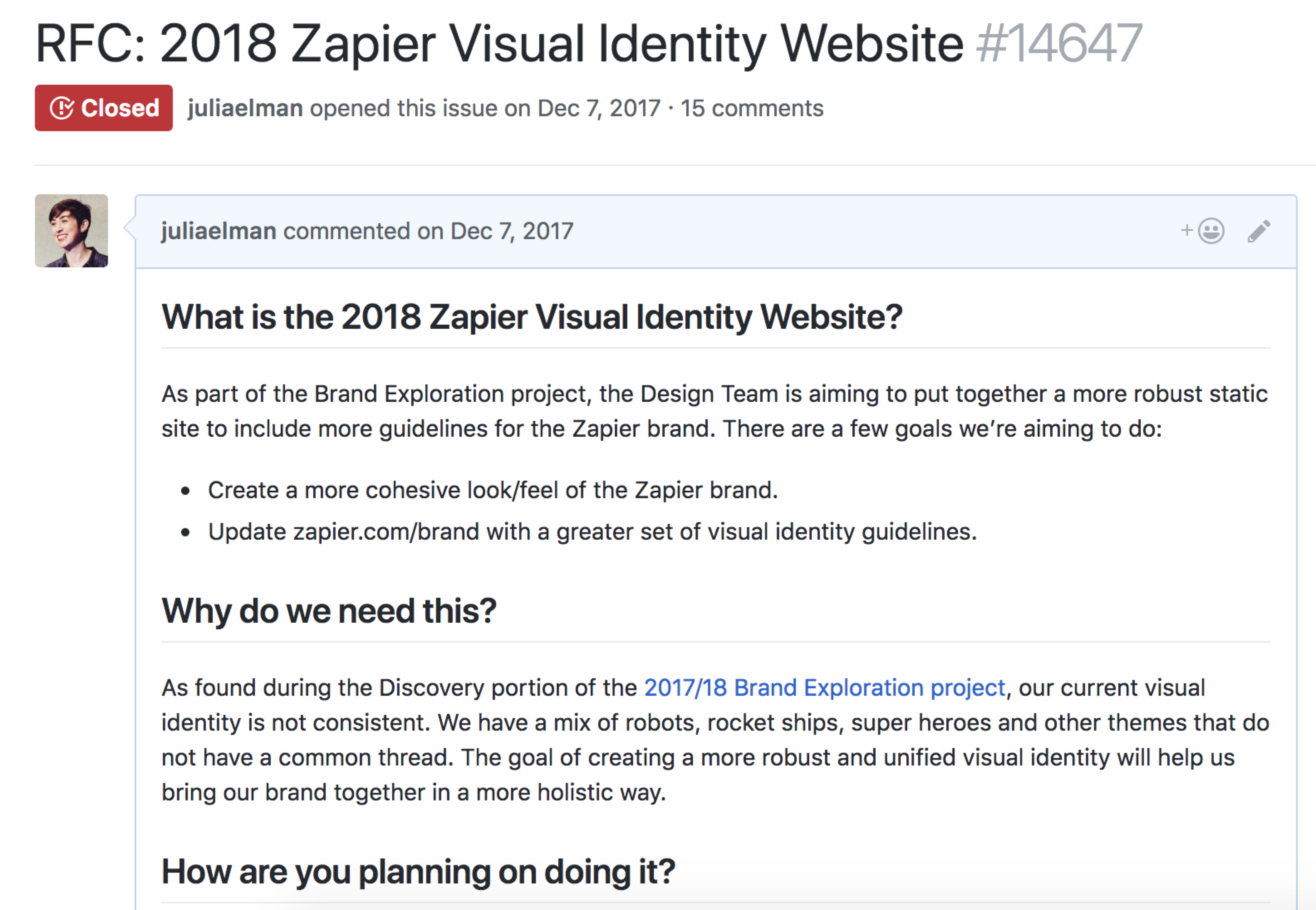
We kicked things off with a “Request For Comment” (RFC) post on our internal GitHub repo to gather insights from the Engineering Team around specific questions we had around the stack we’d use. An RFC not only helps bring awareness to the team about this project, but also creates a transparent and shared space for answering questions folks may have. It is good to get those insights early and often in a project, rather than right before or after launching.
The RFC not only included questions around our tech stack, but also on the information architecture we’d use to for the site's navigational structure. Here are the sections we decided on:
- Logo
- Assets
- Usage Guidelines
- Colors
- Primary
- Secondary
- Color combinations
- Typography
- Typeface
- Size
- Weight
- Line height
- Spacing
- Illustrations
- Animations
- Content
You’ll notice we included a section that you might not have seen in other branding sites: the Zapier Content Style Guide. The rationale behind specifically adding this to the Visual Identity website was to keep content and design close to one another. By combining visual and content, we hope to create and promote a culture where we design for content and instead of writing content for design. Practicing a content-first approach will lead to greater efficiency, better outcomes, and make everyone’s jobs easier.
Getting Organized
After getting final feedback and decision making from the RFC, we settled on using the following technologies to create the visual identity website:
We created a new repo where the code base for the visual identity would live and where we could easily track the work using GitHub issues. Each issue revolved around a specific task that a team member could pick up and assign to themselves at any time. These issues would range from creating a high-level wireframe for a specific page to creating the deploy scripts for the production site. The team enjoyed the ability and freedom to move quickly and efficiently in this way. Using this method has helped us as a remote design team with a single source of truth that gives team members the freedom of what to work on.
Keeping in Sync
Each Design Team member is embedded on a specific Product Team at Zapier, with that work set as their priority. To stay organized, our team uses Friday as the day to work on functional team work. We scheduled a regularly occurring meeting every Friday to check-in synchronously as a team on the work happening on the visual identity. Throughout the rest of the week, we used asynchronous methods of communication to keep in touch with the work we were doing. Whether it was posting updates on a GitHub issue or bringing high-fidelity wireframes to the Design Club (our weekly critique meeting), this method of infrequent meetings helped free up time not only to be creative, but to actually do the work.
Phase Three: Launch
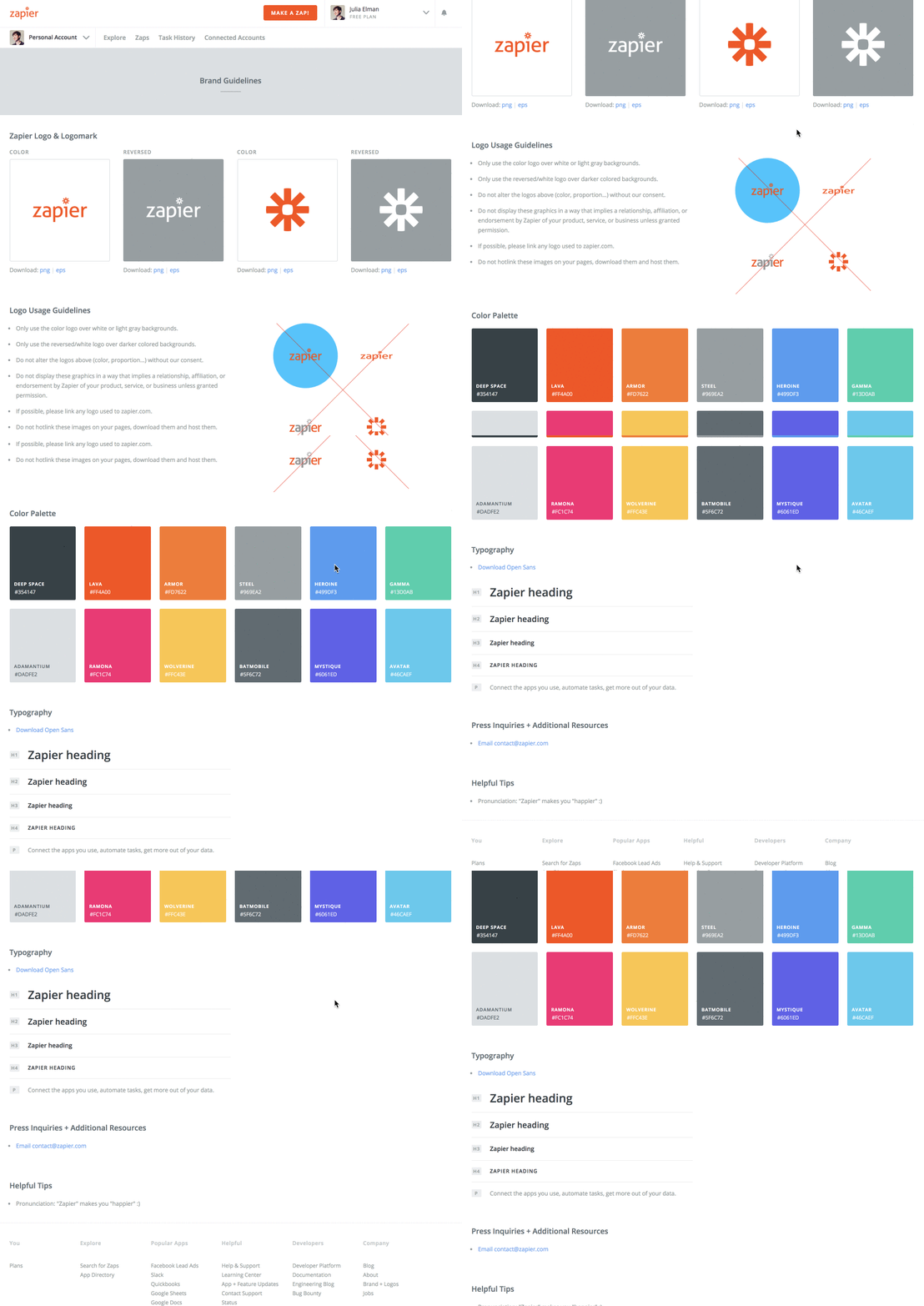
With the research, design and build work finished, we launched the Zapier Visual Identity website. This updated version of the visual identity is an upgrade from our original brand page and includes a more robust set of information around the Zapier brand for our marketing purposes. Below are some before/after shots to give you an idea of what has changed.
Before
After

Among the updates and redesign, here are some of our favorite new things:
- Color Shades. There are now an array of shades you can use alongside our existing color palette, each with their own superhero names thanks to Zapier CEO and co-founder Wade Foster.
- Zapier Content Style Guide. The Zapier Content Style Guide now lives inside of the Visual Identity Website.
- Applings and Zaplings. As some of you may have seen during the Shared Folders launch, we have some new little friends joining the Zapier family: Applings and Zaplings.
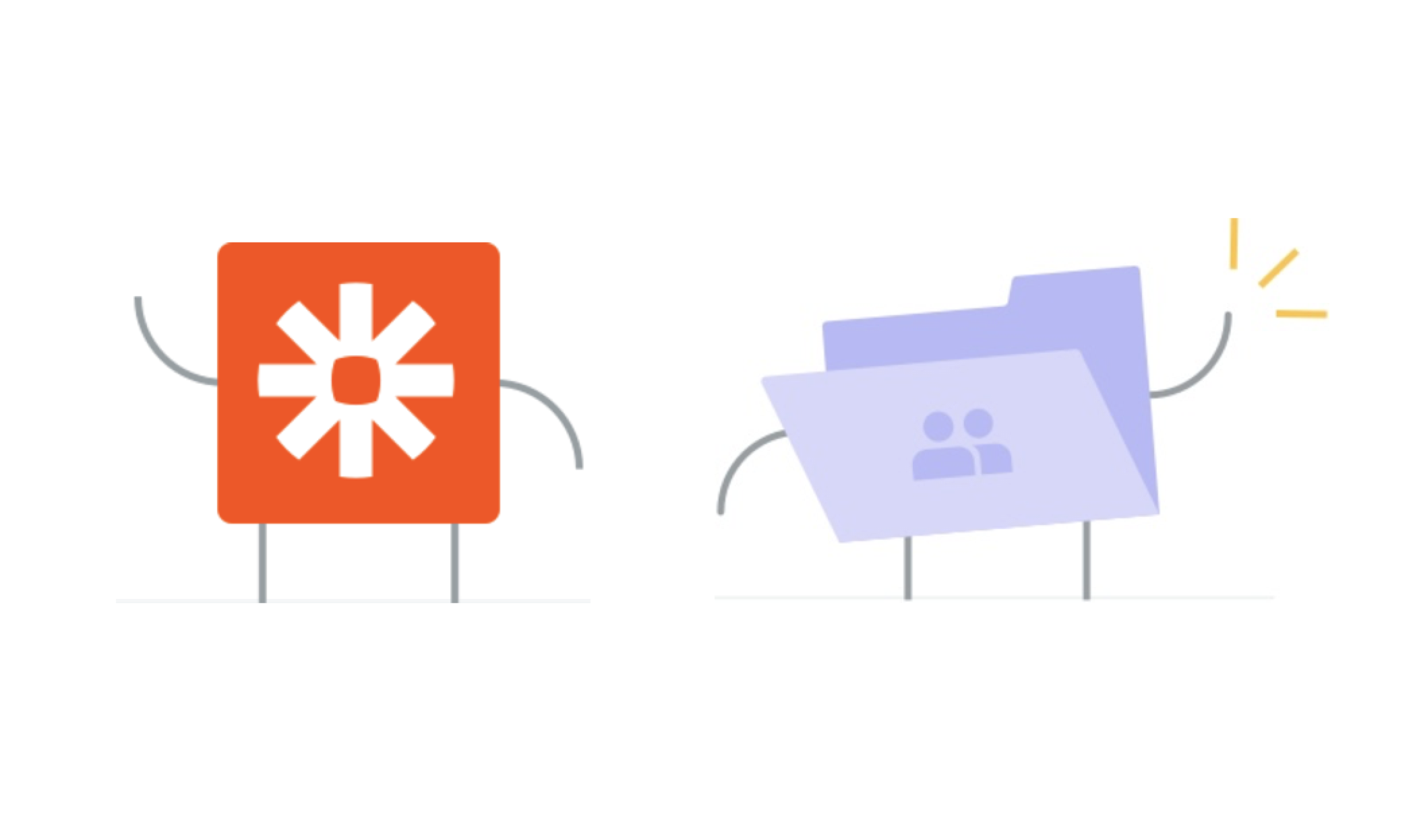
Applings use a partner’s logo to talk about the relationship we have with them.
Zaplings are primarily UI elements that either support Applings or educate our users on a subject—like two-factor authentication or reaching 1,000 Apps.
Evaluations of a brand are not always easy. There are many voices and feelings each step of the way. By going through a brand exploration process you not only gain a vantage point of your brand, but also bring the many talented people on your team together to create an experience they are proud of. Everyone starts with their own opinions on our brand, and through the work we end up with a cohesive vision of our brand and how to take our work forward as a team.
We’re constantly iterating and refining Zapier's Visual Identity to help create cohesive experience through our over 1,000 app integrations. Got ideas for how we can make it even better? Feel free to leave a comment below or email us at contact@zapier.com with feedback on how we can improve. We’d love to hear from you.
source https://zapier.com/blog/remote-design-visual-identity/

No comments:
Post a Comment