It came as a flash while reading on a lazy Saturday morning, as all good ideas do. I wonder if you could make a fill-in-the-blank question in an online form?
Sounds easy enough. Turns out, not quite so much.
Online form builders pride themselves on including dozens of question types—but as it turns out, fill-in-the-blank questions aren't that commonly supported. Most forms show questions one after another, with a title followed by a text box or dropdown to enter the answer.

I wanted a form where you could ask "How do you __ in App?", with the blank area being a text area and App a drop-down to pick an app name. The best you could do in most form apps—say, in Google Forms for instance—is to split the question into two sections. I instead wanted something more like this—which is possible with a bit more work.

Turns out, there are ways to build real fill-in-the-blank questions, though they often take a workaround. Here's how I built my form in JotForm—along with a handful of other apps that could also fit the bill.
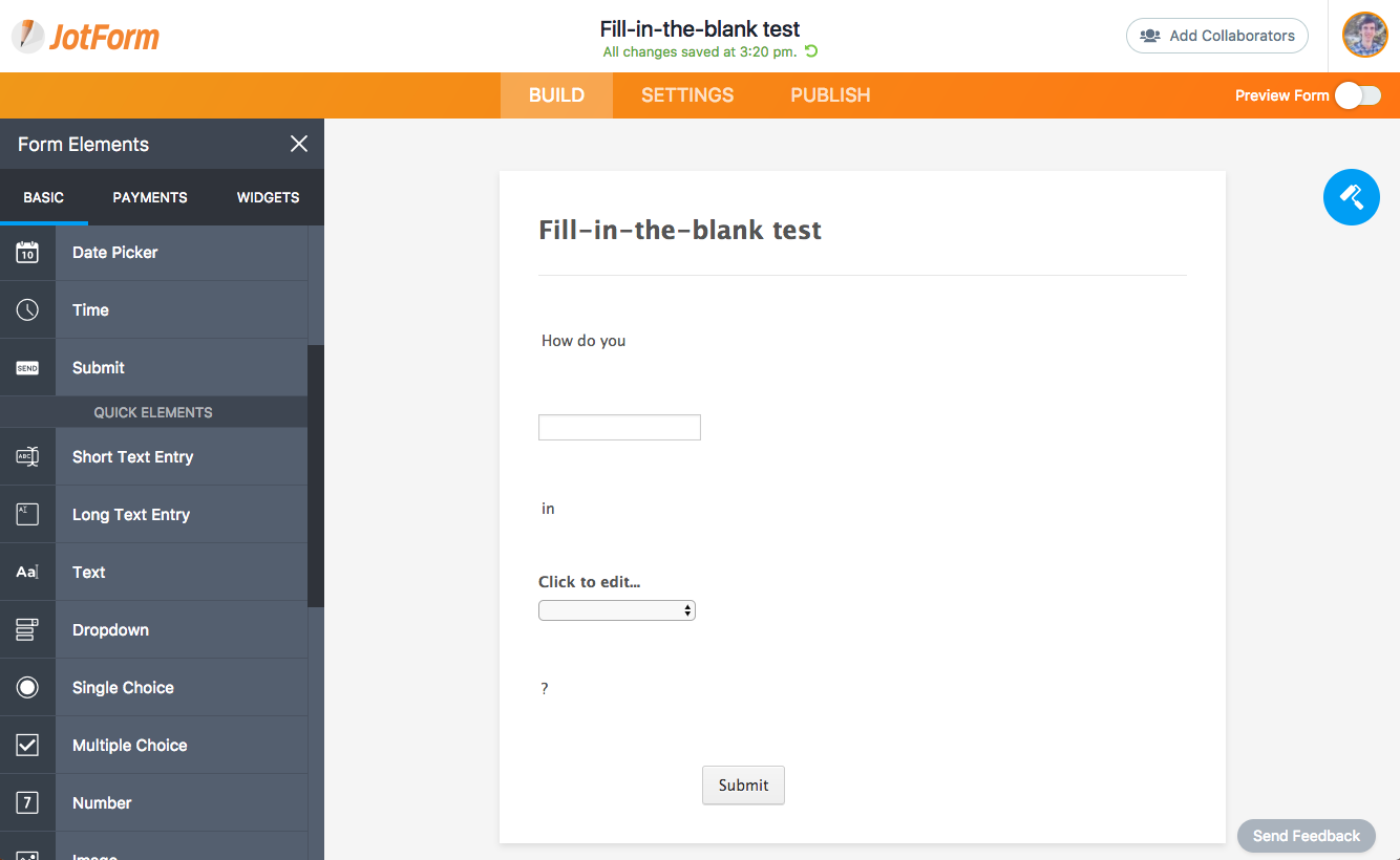
Just open JotForm, and make a free account if you don't already have one. That'll let you get up to 100 responses to your form each month for free—perfect for starting out.
Then drag in the form elements your form will need. To make my form, I need 5 elements: Three text elements, a short text entry element, and a dropdown element. Drag them in one after the other and enter the correct text. Here I've entered How do you in the first text element, then I added a short text entry box where people can enter their question. I then have a second text element with the word in, followed by a dropdown to select their app and a final text element with a ? to finish the sentence.
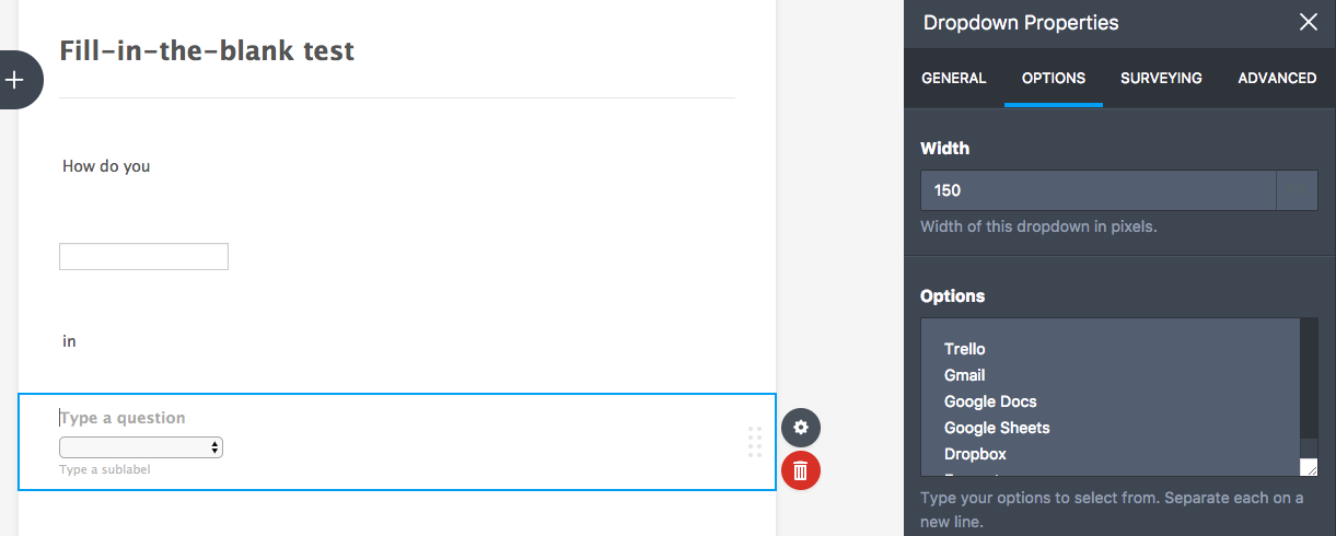
The short text and dropdown elements will include a question at the top by default. Just remove that text—we don't need the question above the form field, as we're writing the question inline.
You'll only need to tweak one field's settings: The dropdown. Select it, then tap the gear icon to open the properties pane and select the Options tab there. Enter the options you want in the dropdown to finish it out. I've added the apps people can ask questions about—you might list other options or perhaps skip the dropdown if you only want a text question.
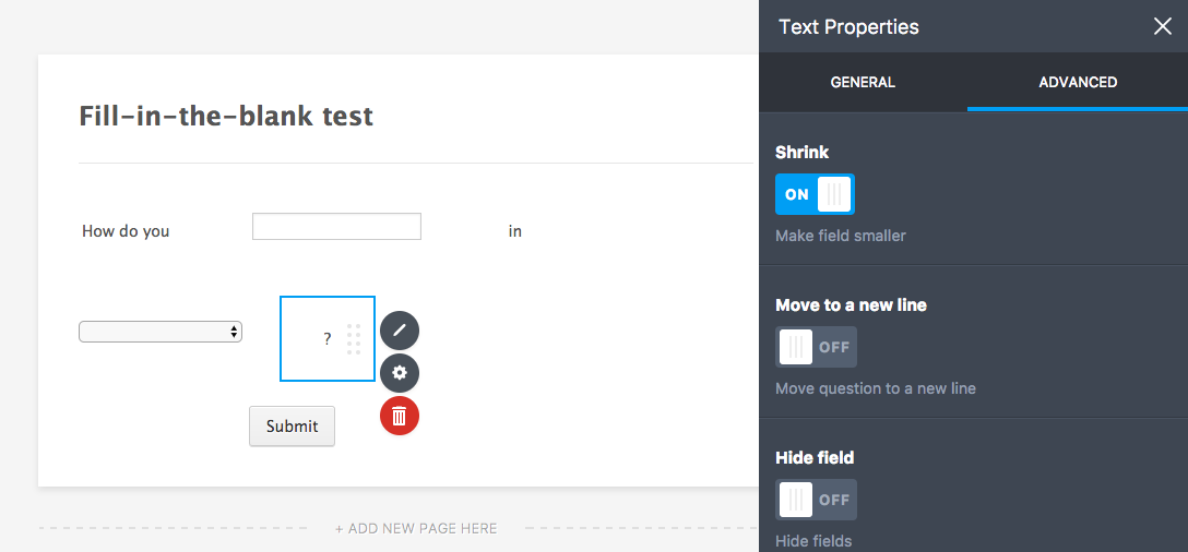
Now, let's tweak the questions to get everything in one line. Open each form element's properties pane, select Advanced, and tap the Shrink slider. That'll make the form element shrink down as small as possible.
As you do that, one by one the elements will line up in a sentence—or almost. With 5 form elements, our sentence takes up two lines by default.
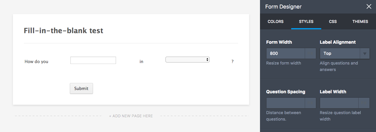
To fix that, tap the paint roller icon on the right of JotForm's screen to open the Form Designer. Select the Styles tab, then enter a new width for your form. 800 worked well for our form; yours may need a different size depending on your fill-in-the-blank question.
The Designer pane includes a number of other options to tweak your form's design. You can remove the question spacing to line things up better, choose a font that fits your site's design, and select new colors for your form. JotForm also includes pre-made themes—though be careful, as your fill-in-the-blank question may look different in them.

The best way to make your form look just like you want is to select the Advanced Designer button at the bottom of the Designer pane. That'll open a full designer window, where you can select each element on your form and customize it directly. If you're comfortable customizing CSS code, you can add it from the CSS pane. Select an element in your form, and you can then directly write CSS for it without having to figure out the element name.
The JotForm forum includes a number of tips and tricks to customize your form's design, with CSS code to remove the shadow from a form, decrease padding, remove form field borders, and much more. Decreasing the padding is most important; you'll want to add negative padding to most of your form columns, to make the sentence not have so much space between elements and look more like a real sentence.
Between those tips and other CSS tricks, I got our form to look the way I wanted. The text field looks like a blank in a fill-in-the-blank sentence, and the dropdown barely looks like a dropdown. It's similar to a paper fill-in-the-blank quiz, except in a digital online form.
And that's it. With a bit of tweaking, uncovering hidden features, and coding in CSS, your new form can look like this:
Use Your Fill-in-the-Blank Questions
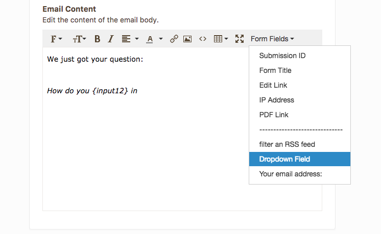
Now it's time to put your form results to work. Normally, you'd just need the answers—but this time, you might need to format stuff a bit different to make sure you see the question the same way your respondent did.
In JotForm's Settings, you can send an email to your respondent or yourself with details about what they entered. Normally, JotForm will show each question and answer in a table. Delete that, and instead write out your sentence, filling in the blanks with your form fields.

Want to save your form responses to a spreadsheet, get notified about them in Slack, or turn them into a document in WebMerge? You can do that and more with JotForm's Zapier integrations. Just, as in the email, be careful to recreate your full sentence from the form elements to make sure things don't get confusing.
Make a Fill-in-the-Blank Question in Your Favorite Form App
JotForm's not the only form app that lets you make a fill-in-the-blank question in your online form. All you need to make one is a form that supports multiple columns—and ideally that lets you remove the question text from above text and dropdown options.
Here are some options that fit the bill, at least in part:
- PlanSo Forms may be the next best option. Use its Paragraph element to add text, and just drag-and-drop the sections near each other to instantly turn them into a multi-column sentence.
- 123ContactForm also lets you drag form fields side-by-side, though you're capped at 4 fields in one row—so you couldn't include the question mark in our form.
- Wufoo includes CSS Keywords, which you can use to arrange up to 3 form fields in a row for a simple fill-in-the-blank question.
- Gravity Forms, a form plugin for WordPress-powered sites, uses similar CSS Ready Classes to let you add up to 5 columns—which you could use to create a form like the one above.
- Formstack does include multiple columns, but text and dropdown fields are required to include a header—which would require some thoughtful writing make your fill-in-the-blank question look correct.
Learn More About Forms with The Ultimate Guide to Forms and Surveys
Online form apps are some of the most versatile tools. You can put together a quick contact form for your site or build a prototype of your next app idea all with a drag-and-drop form editor.
They're simple enough to learn how to use, but are also packed with hidden features that you'll have to poke around to find. We've done that research for you, pulling together best apps, tips, and tricks for forms and surveys in our Ultimate Guide to Forms and Surveys book. Whether you need a new app for your next form, or are wondering how to analyze your survey results, it's the free guide you should read first.
source https://zapier.com/blog/fill-in-the-blank-form/


No comments:
Post a Comment