The newly redesigned Google Sites is a great place to start a website for free. In minutes, you can add text and images, embed documents and maps, and share it with a customized link—though not on your own domain name yet.
It's far easier to use than the older, Google Docs-styled website builder that used to power Google Sites. At first glance, the only downside would seem to be that you can only make a single-column site layout. Add a new section—say a text or image block—and it'll be added under your existing sections, where you can drag it above or below, but not beside, another section.
Except actually you can with Google Sites' hidden pie menu.

Pie menus—also called radial or circular menus—are a fabled part of computer software design, something more likely to show up in a sci-fi Minority Report-style computer than in real life. Unlike the rectangle menus in most apps that make you click the menu and drag your mouse down to find the item you want, pie menus put all the options right near your mouse. Yet their real-world usage is surprisingly sparse, showing up primarily in tech demos, games, and movies.
That's starting to change. Microsoft included a pie menu in the Windows Store version of OneNote in Windows 8 and 10 and demoed pie-style menus with the Surface Studio computer. And, surprise: Google included one in the new Google Sites as well.
It's with this hidden pie menu that you can add multiple columns to your Google Sites website. Here's how.
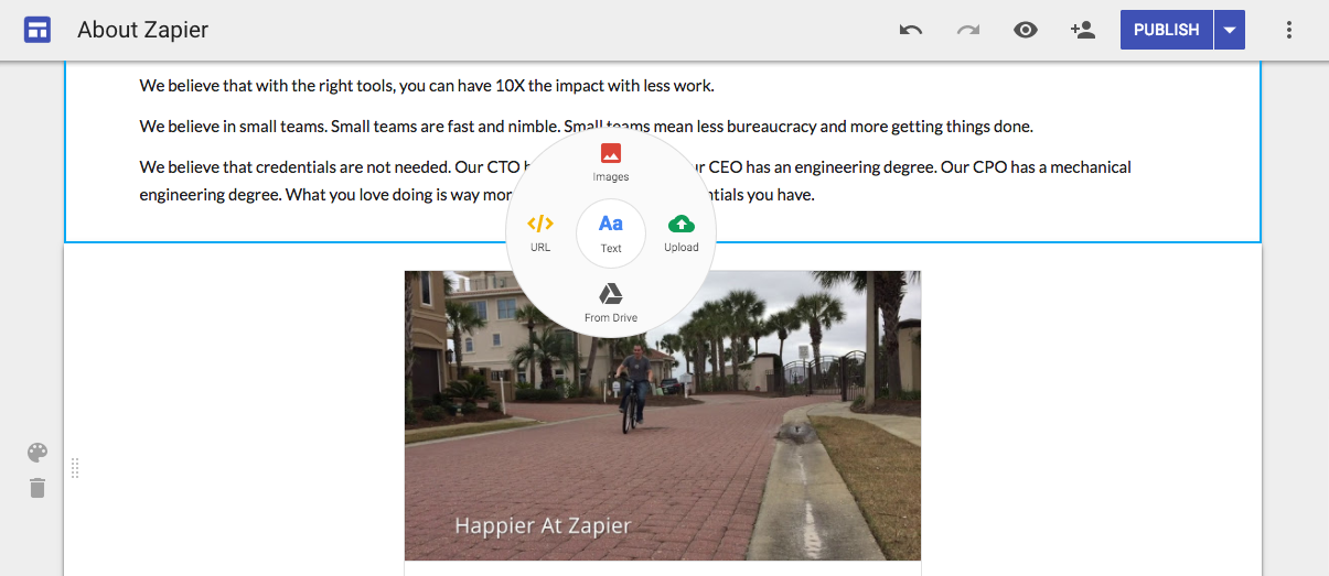
First, open the Google Sites editor and double-click anywhere on your Google Site where you'd like to add multiple columns. That'll open the hidden circle menu. Select what you'd like to add in the extra columns: Text, an image from your Google Drive, embedded media such as a video from a link, a Google Drive file, or an uploaded image.

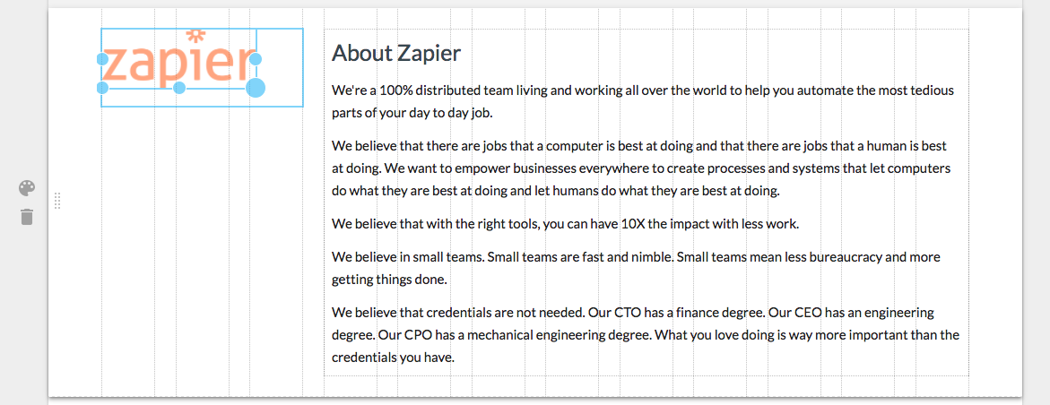
That'll add a new column to the area where you clicked—if you open the menu near the left, the new column will show up on the left of the section. You can then click the blue outline around your section to move around and resize it. Google Sites includes gridlines to help you line things up nicely, and if you hold your Shift key while resizing an image section, Google will keep the original aspect ratio.

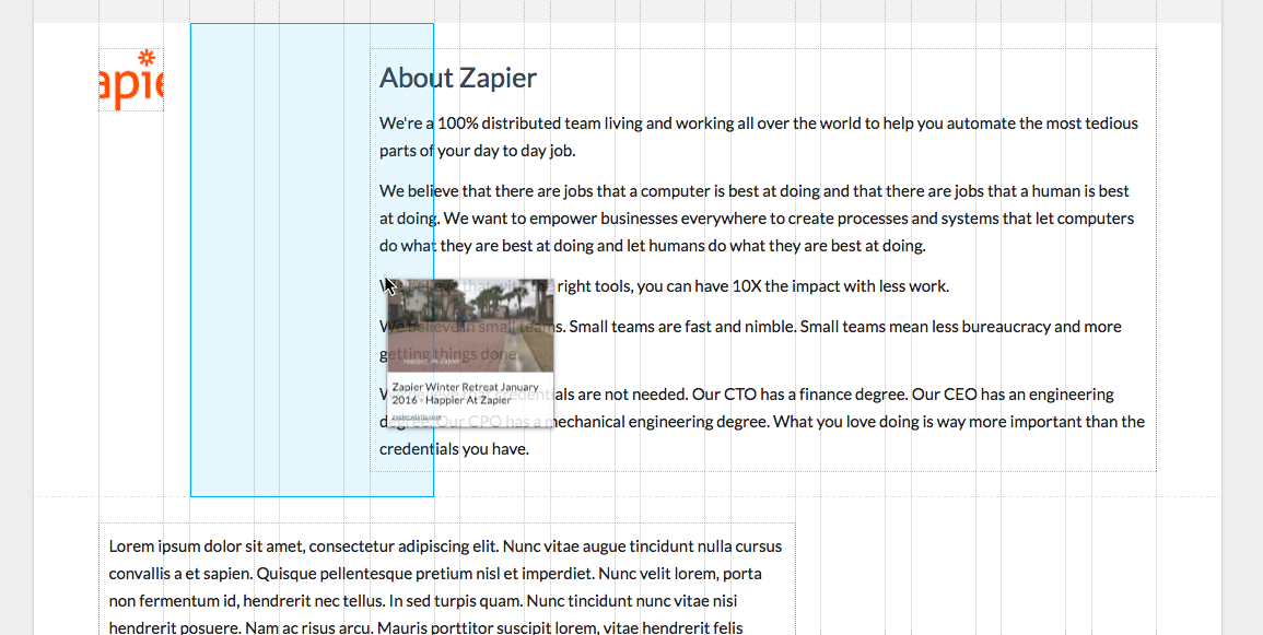
Want to move something into another section and turn that section into a multiple column layout? Just select that item and click on the dotted section in the top middle. Drag it to the area you want, and Google Sites will automatically resize everything else to fit around it.
So, the next time you're building a site or tweaking a layout in Google Sites, double-click somewhere on your page. It's worth adding multiple columns to a layout just to see the hidden menu.
Learn How to Build a Your Next Website in Google Sites
Whether building your first website or a landing page for a new project, the new Google Sites is a great place to build it for free. In just a few minutes, you can add your photos, text, videos, maps, and even Google Drive files into a layout that's easy to customize—with multiple columns, too.
Read our full Google Sites tutorial and learn how to build your own free website in 5 minutes.
source https://zapier.com/blog/google-sites-secrets/


No comments:
Post a Comment